I like this
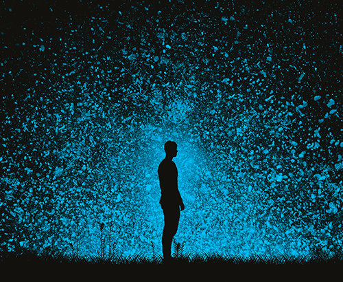
Selecting the right lighting for a retail store is important. Whether it’s accent, ambient, or general lighting, the lights and fixtures you choose can change how customers perceive the paint color of a room, the tint of an item in a store window, or the color of a striped dress—from blue and black to white and gold.
Or was it blue and orange?
To emphasize the importance of lighting in a retail space, recall the harrowing week in February of 2015 when no one could agree on the colors in a photo of a dress. The picture was first posted on Tumblr, then picked up by Buzzfeed, Twitter, and many other media outlets before going viral. Differing assessments from confused Twitter users spread like wildfire. Even Taylor Swift weighed in. The mystery of the dress perplexed so many it escaped the confines of the Web and infected mainstream news shows and talk shows such as Ellen, who saw the dress as white and gold and lamented that arguing over it was “tearing apart friendships and families. This is why I don’t wear dresses.”
Eventually, a clerk at the store where the dress was sold and the discoverer of the dress confirmed its true blue hues. So why did some people see white and gold or blue and orange instead of the actual true color of the dress? Shortly after #TheDress blew up, Buzzfeed and Wired spoke to neuroscientists to find out what exactly was going on.
As it turned out, it was all about the lighting. When the human eye perceives light, it reflects off whatever we look at, enters the eye, and hits the retina. The brain then processes the image, takes the right color out of the light that bounces off what the eyes see, and subtracts that color from the real color of the object.
“Our visual system is supposed to throw away information about the illuminant and extract information about the actual reflectance," Jay Neitz, a neuroscientist at the University of Washington, told Wired. "But I've studied individual differences in color vision for 30 years, and this is one of the biggest individual differences I've ever seen."
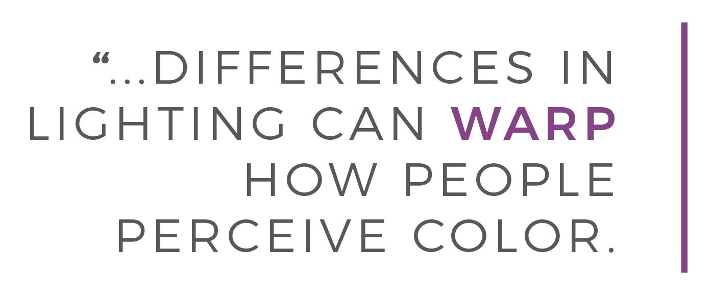
But differences in lighting can warp how people perceive color. And it can seem as if colors change depending on surrounding colors, like in the background of the #TheDress. When Wired’s photo team used Photoshop to determine the actual colors, they discovered that context means everything. At first, they thought the dress was white and gold. When the image was white-balanced, though, there were still hints of blue where there should be white, and black where there should be gold. When the picture was balanced to its darkest pixel, the dress showed up as blue and black.
"It became clear that the appropriate point in the image to balance from is the black point," Wired’s former senior photo editor Neil Harris said.
When context varies, so does perception. Ever try on a blouse, shirt, or pair of shorts in a dressing room, decide you like the color, then go home, try them on again and realize—whoa!—the color is way off? That's what's at play here.
To avoid another headline-nabbing meme, it’s important for retail designers to coordinate with architects, brand managers, and display designers to determine the right color spectrum that will make your products pop. And if you're a consumer, make sure that you can return that dress if the color isn't what you thought it was once you got out into the sunlight.
Related Products