Top Ten Challenges For Solid-State Lighting: #1 – Color
December 2015 - by Aurelien David, SORAA's Chief Scientist
I like this
Without a doubt, color rendition is a key subject of fascination – or lament? – among advanced lighting users. A lot of confusion reigns on this topic, for at least one good reason: it’s complicated! Having been fairly involved in the field over the past few years, I’d like to kick off some thoughts.
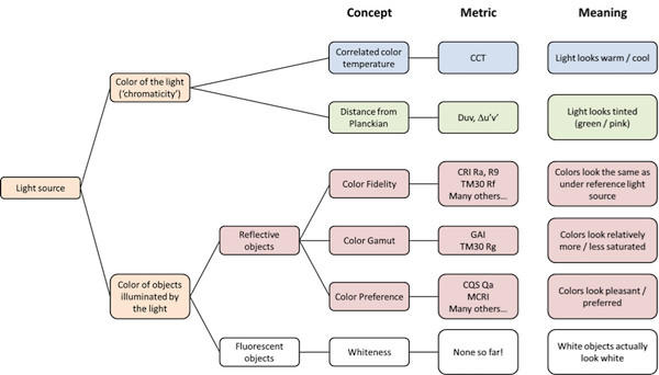
The complexity of color rendition comes in part from the many phenomena involved in our perception of colors. First, there is the color of the light itself (when viewed directly, or shined on a white wall), often called chromaticity. Chromaticity is usually characterized by correlated color temperature a.k.a. CCT (from warm sources like candles, to colder sources like sunlight) and distance from the Planckian locus (which indicates the tint of the light for a given CCT: towards green or pink). In principle, two light sources having the same calculated chromaticity should be perceived as having the same light color. In practice though this is almost never the case, in part due to imperfections in color science – a story which deserves, and will get, an entry of its own.
A practical consequence of this issue, tough, is that lighting products from different manufacturers, despite an identical nominal CCT, often show differences in tint. Our eyes can be very sensitive to these slight mismatches in chromaticity, which means that pairing different products in a same installation is often problematic…
Beyond chromaticity, a trickier topic is the color of objects under illumination. Two light sources may have the same chromaticity but very different spectra. When illuminating various objects these light sources will usually render colors differently (an effect called illuminant metamerism). A key goal of efficient lighting is to optimize the spectrum of the light to reduce the use of “inefficient” wavelengths at both end of the visible spectrum; however, this must be balanced against the risk of poor color rendition and color distortion.

Considerable effort in color science goes to evaluating the effect of a light source on object’s colors. This is described by the generic term color rendition, which actually encompasses a variety of aspects. An important aspect is color fidelity, which describes whether colors look the same as they would under natural light sources (e.g. sunlight, incandescent and halogen). Fidelity is a well-defined and objective concept. There are also subjective aspects to color rendition, such as color preference. A lot of research is going on to properly define a metric for color preference, but this is a challenging job which will probably take years. In the meantime, a decent proxy for color preference is a more objective concept called color gamut, which evaluates the average change in object’s chroma.
The CRI is a well-known example of a fidelity metric, although it has a number of problematic issues. There have been expansive academic efforts in past decades to either replace or complement CRI with other metrics. The most recent incarnation of such efforts is the IES Color Rendition Method, nicknamed TM30, which the IES released a few months ago and has already started making some noise. I was heavily involved in the work which led to TM30, and I’ll have more to tell in the near future.
All these metrics, though, pertain to the colors of “standard” reflective objects. However our environment also features fluorescent objects (i.e. objects which convert light from one wavelength to another upon illumination). Most importantly, this is the case of a large number of white objects. White fabrics, papers, plastics – even our teeth! All these objects contain violet-absorbing “whitening agents” which enhance our perception of the color white. Looking around us, these objects are prevalent, so the ability of a light source to render whiteness is a crucial aspect of color quality. Unfortunately, this effect is ignored by all existing color rendition metrics – from CRI to TM30 and beyond! Here again, academic work is ongoing to define a suitable whiteness metric, which will be used together with other color metrics such as TM30.
Confused yet? I’ll throw in a non-comprehensive sketch which may help clarify the hierarchy of things…

There is a lot more about color rendition than can be covered in just one article; starting next year, I will dive deeper into these topics, including TM-30, in a series of color-themed blogs. Stay tuned!


