I like this
Two weeks back, we reviewed how color shifts could affect an object’s colors – in general, a mix of hue shift and saturation shift (more or less saturation) can occur. As we saw, the CRI is only interested in the absolute magnitude of this shift, and therefore gives no information on the type of shift – although this information is relevant to our perception. Today, I want to explain how TM-30 provides that additional information.
Let’s first see how we can visualize color shifts in a color space. A color space is just a space where all the colors we can see are categorized – there is some underlying math, but the interpretation is somewhat intuitive. The figure below shows a sketch of a color space; various colors are characterized by their hue and saturation (the third dimension is not show to keep things simple: it corresponds to lightness, i.e. whether a color is dark or light). The natural color (see last week’s blog) of an object illuminated by a light source corresponds to a point in this graph; a light source (say an LED) may cause a color shift, therefore placing the object at another point. For instance Figure 1 shows the example of an LED source which makes red objects more saturated (positive saturation shift) and orange objects look yellowish (hue shift) – all this with respect to natural colors. As we see, by drawing arrows in the color space, we can tell how the LED source distorts colors.
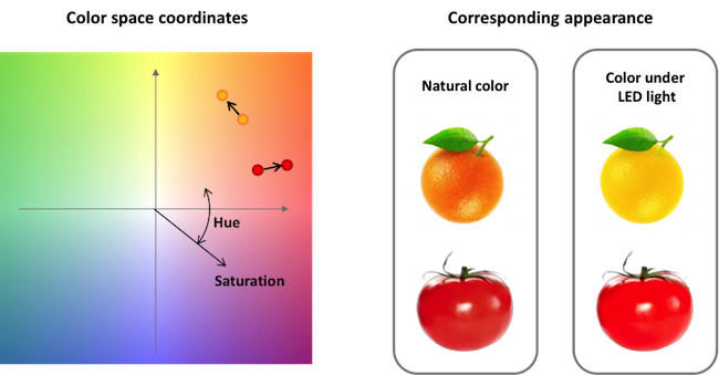 Figure 1. Left: sketch of a color space. Saturation increases from the center to the edge of the plot. In this example, the color coordinates of two objects (a tomato and an orange) are plotted under natural light and under an LED light. The LED light increases the saturation of the tomato (making it look riper), and shifts the hue of the orange towards yellow (making it more like a lemon). The corresponding appearance is shown on the right.
This is exactly how the TM-30 method works: it considers ninety-nine real-world objects having a variety of colors – these were carefully chosen for their reflectance properties, but that’s a story for another time! For each object, it computes the color shift induced by the light source of interest. Then, the objects are gathered in hue bins and an average shift is calculated in each bin. Thus we obtain the diagram of Figure 2; this is called the color vector graphic, and it is one of the outputs of TM-30. This graph tells us how, on average, various colors are distorted. Its visual interpretation is intuitive: outward arrows mean more saturated colors; inward arrows mean duller colors; sideways arrows mean a hue shift; and no arrow means that the color isn’t distorted!
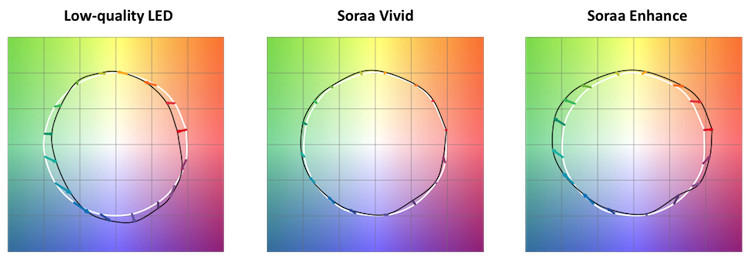 Figure 2. Color vector graphics from TM-30. The arrows show how colors are distorted from their natural colors (which lie on the white circle) by various light sources. Low-quality LEDs desaturate various colors, especially red and other warm tones, making them look dull: they are characterized by a low Rf and a low Rg. SORAA Vivid renders natural colors and hardly causes any distortion: it is characterized by a high Rf. SORAA Enhance selectively increases the saturation of warm tones: it is characterized by a moderate Rf and a high Rg.
The next question, of course, is: what do we do with this information? This is where things get more complicated, because the answer depends on what we want from the light source. However, a few things are generally true. 1) We dislike de-saturated colors, especially for warm colors (red, pink, orange). 2) We dislike hue shifts, because they make colors look unfamiliar. 3) In some cases, we want colors to look natural – in this case, we want no color shift whatsoever. 4) In other cases, we like over-saturated colors (again, that’s especially true for warm colors). Thus a very simple rule-of-thumb is that lighting users may want either sources that don’t distort colors or sources that “enhance” some colors – and we can determine all that from the color vector graphic.
This takes us to the next step in TM-30, which is to reduce that graphic to only two numbers, for simplicity. The first number is the fidelity index Rf. Fidelity means “no color distortion”. Rf simply measures the average length of the arrows in the color vector graphic. If all the arrows have zero length, colors are “natural”, and Rf takes a maximum value of 100. As color shifts occur, the arrows get longer and Rf decreases (to a minimum value of zero). This is similar to what the CRI Ra does – but the better science in TM-30 makes the prediction of Rf more accurate.
The second number is the gamut index Rg. It indicates whether, on average, a light source over-saturates or under-saturates colors. Rg is calculated as the area of the shape connecting the tips of the arrows. A value of 100 means that the shape has the same area as it did under natural light – in other words, no average change in saturation. A value over 100 means that saturation tends to be increased,– and vice-versa for Rg below 100.
One thing that’s important to understand is that Rf and Rg are intrinsically tied. If Rf equals 100, there is no color shift; in that case Rg must also be equal to 100. On the other hand, if Rf decreases there are some color shifts, and Rg can assume a value above or below 100. Roughly speaking, we can trade one point of Rf for a point of Rg. Therefore, if we want a “color-enhancing” source with Rg=120, Rf will necessarily be at or below 80. In other words there is no free lunch: increased saturation must come at a cost on color fidelity!
Thus, light sources can be placed on a plot of Rf-Rg values, as shown on Fig. 3.
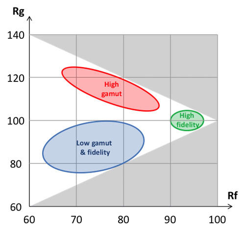 Figure 3. Illustration of the tradeoff between Rf and Rg. Sources can only reside in the non-grayed region. Three zones are of particular interest: in green, the high-fidelity zone where SORAA Vivid resides; in red, the high-gamut zone of SORAA Enhance; in blue, the purgatory of poor-color-quality products.
On that figure, I’m pointing out several regions. The three regions of interest are
- the low-fidelity/low gamut zone, which nobody really likes, but is crowded with many products because it is easy to make such sources more efficient in terms of lumens per watt.
- the high-fidelity zone, which corresponds to high-CRI products like SORAA Vivid and has a clear appeal, but comes at a price on efficiency.
- the intriguing high-gamut zone, which “enhances” colors and can be desirable in some applications.
A word of caution about the latter: Rg tells you that some colors are increased, but it doesn’t say which! At the end of the day, users of saturation-enhancing sources will have to look at the details of the color distortion graphic to really know what they are getting.
This story should help you understand one of the issues with the CRI. We sometimes expect that a low CRI (or a low Rf) is intrinsically bad. That isn’t always the case: sometimes, a source with moderate Rf and high Rg can be pleasant. Again though, most low-CRI sources on the market today also have a low Rg because they favor lumens over color – and that’s why the CRI hasn’t been that bad of an indicator!
This rather long story hopefully clarifies how to understand TM-30 – and I’m welcoming questions at techblog@soraa.com. Next post, I’ll say a bit more about SORAA and TM-30.
For further reading the Official TM-30 document can be obtained here. The scientific article describing the development of TM-30 is in freely accessible here.
Related Products